📊 Mood Is a Metric Too

You might easily think I’ve lost my mind—and you’d be right. It happened a long time ago and hasn’t let go since, so tracking mood changes via a graph isn’t just a quirk anymore, it’s more of a life necessity. You know, like watching a pressure gauge so you can release steam before the tank bursts and sprays its contents all over everything.
Actually, the idea isn’t new at all. During rehab, I found an app called Daylio, which pretty much did what I needed: it would show a daily notification asking “how are you feeling,” offer five response options (awful, bad, meh, good, rad), and allow you to fill in a short activity journal. However, the drawbacks quickly surfaced. Since the journal was filled in once a day or less, the data was often inaccurate. Most of the time, by the end of the workday, I had no energy left for journaling—not even for dumb videos for single-cell organisms—so entries were either postponed or ended up being more negative than my actual mood. What also annoyed me was that Daylio’s data could only be exported manually, and I wanted to track and view data from any device—yes, even a toaster. So I had to take a different approach.
By then, I’d figured out how to trigger notifications via Tasker and scripts in Termux. You might rightly say this madman is inventing janky stuff again, but in the end, the form doesn’t matter. What matters is the process and the result—we’re solving a psychological, not a technical problem. Anyway, I digress. I found a way to pipe data from my phone or computer through middleware into a database, and Termux with Tasker handled that perfectly. Now, about how I tackled the challenge of “tracking mood as accurately as possible throughout the day.” Here’s the formula that crystallized:
A simple notification asks "How are you feeling?" and offers three button-based responses:
- "Good!": means I’m happy and generally satisfied. The script assigns +10 points for this answer.
- "Bad": means I’m in pain, scared, uncomfortable, or otherwise feeling bad, and I wouldn’t want to stay like this long. This answer gets -10 points.
- "Meh": means I’m neither happy nor sad; I’m fed, clothed, relatively healthy, and not getting rained on. This answer gets +2 points.
Each day starts at a baseline of 50 points—right in the neutral zone, neither good nor bad. Over the course of five prompts per day, you could reach 100 points (feeling like a million bucks) or crash to zero (somebody please kill me). After answering, the script sends a special payload to a message queue, from which a cronjob picks it up and stores the necessary data into an SQLite database. Once a day, another cronjob sums things up and logs it with timestamps into a neighboring table, producing a nice-looking graph.
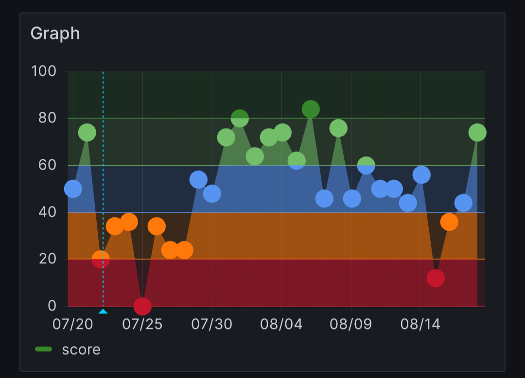
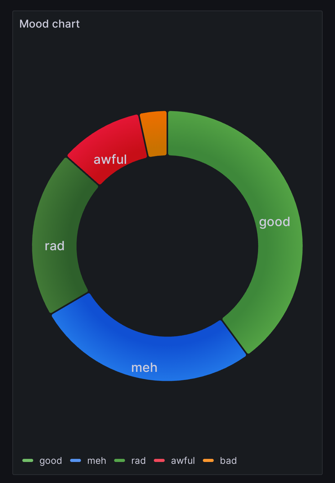
Yes, I’m using SQLite as a time-series database here, which works just fine at this scale. The beauty of using Grafana is that you can display the data in any slice over any time period. For example, I also have a pie chart that shows distribution across the categories.
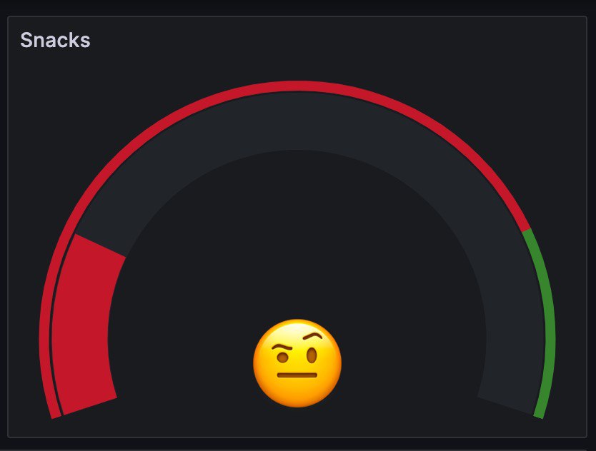
I’m also trying to add (often just forget about it) a chart for tracking my junk food snacking—yep, that’s one of my weaknesses. Same mechanism: five times a day, a notification asks if I’ve binged on street food. For every “no,” I get one point. The goal is to earn five points a day. The system isn’t working well; I’m thinking of how to improve it, because the problem isn’t the chart but the uncontrollable urge to shovel trash food into myself. Still, it’s worth a look at the graph.
Technical Details
Any tile on the dashboard is essentially a database query via a data source plugin. Some tiles require time-series data, so the database must have a column with Unix timestamps tied to the data.
Here’s an example query for total mood per day:
select cast(time as int) as ts, score from totalmoodscore;In the database itself, it looks like this:
sqlite> select * from totalmoodscore limit 10;
1682373481|40
1682459881|48
1682546281|48
1680991200|85
1680904800|45
1680818400|45
1680732000|45
1680645600|45
1680559200|65
1680472800|45
sqlite> .schema totalmoodscore
CREATE TABLE totalmoodscore (time timestamp default (strftime('%s', 'now')), score integer);
The SQLite datasource plugin is available for installation right from Grafana’s admin panel. You can also configure it there by specifying the database file.
In Conclusion
Well, first of all, I needed this just to make another fun toy to stretch my brain. But the project has long since reached a usable (by me) state, and I actively use it. When something feels off, I can pull up the graph and see when it all started going downhill. Plus, Grafana lets you place annotations and comments on any point in the graph, which is super handy: this is when I got sick, that’s when some other crap happened, and there—I just felt like a turd. Having all this data makes it way easier on your conscience—and your wallet—to decide to rest, take a short vacation, hit the sauna, or schedule an emergency therapy session if things get really bad.
Stay healthy, and remember—there’s no one closer to you than yourself!
Mon, 16 Jun 2025 12:32:04 +0200
RSS // Telegram // Статистика